The file pelicanconf.py
Here is a complete example of the pelicanconf.py file, as used for the present documentation of the theme. It starts by setting some standard pelican variables, as usual. Then, come the theme's and the optional plugins.
# =============================
# 1. standard pelican variables
# =============================
SITEURL      = 'http://galleria.artliba.org'
SITENAME     = 'Galleria'
AUTHOR       = 'Pirogh Hesse'
SITESUBTITLE = 'A responsive pelican gallery plugin'
TIMEZONE     = 'Europe/Paris'
DEFAULT_LANG = 'en'
LOCALE       = 'C'

PATH         = 'content'
STATIC_PATHS = ['images', 'theme']

OUTPUT_PATH  = 'output'

DISPLAY_CATEGORIES_ON_MENU = False # choose a custom top menu here
MENUITEMS = (
  ('About',      'about.html'),
  ('All',        'index.html'),
  ('Overview',   '1a-getting-started.html'),
  ('Directive',  '1b-directive.html'),
  ('Config',     '1c-pelicanconf.html'),
  ('#Tags',      'tags.html'),
)
DEFAULT_PAGINATION =   6; # article summaries per page
SUMMARY_MAX_LENGTH = 100; # counted in words

RELATIVE_URLS                    = True
SLUGIFY_SOURCE                   = 'basename'
ARTICLE_URL   = ARTICLE_SAVE_AS  = '{slug}.html'
CATEGORY_URL  = CATEGORY_SAVE_AS = '{slug}.html'
TAG_URL       = TAG_SAVE_AS      = '{slug}.html'
AUTHOR_URL    = AUTHOR_SAVE_AS   = '{slug}.html'
ARCHIVES_SAVE_AS                 = 'archives.html'
YEAR_ARCHIVE_SAVE_AS             = 'archive_{date:%Y}.html'
MONTH_ARCHIVE_SAVE_AS            = 'archive_{date:%Y}_{date:%m}.html'
# =============================
# 2. Lepagito theme
# =============================
THEME = '/home/hesse/dvt-perso/lepagito'
#TAGS_BY_GROUPS = (
#  ('Pelican',       ('tag-group', 'navigation', 'plugin', 'pelicanconf.py')),
#)
FOOTERMENUITEMS = (
  ('About',    'about.html'),
  ('License',  'about.html#license-1'),
)
LEPAGITO_NAVIGATION_SWAP = True
# =============================
# 3. plugins
# =============================
PLUGIN_PATHS  = ['/home/hesse/dvt-perso/theme-config/pelican/plugins',
                 '/home/hesse/dvt-perso/galleria/pelican/plugins',
                 '/home/hesse/pelican-plugins/search/pelican/plugins']
PLUGINS = ['theme_config', 'neighbors', 'galleria', 'search']
LEPAGITO_HAVE_SEARCH_MENU = ('search' in PLUGINS) # activate search menu

# =============================
# 4. configuration
# =============================
GALLERIA_LIBRARY_PATH          = ['/home/hesse/dvt-perso/galleria/doc/content']
LEPAGITO_GALLERY_CSS_FILE      = 'galleria.css'
GALLERIA_PROCESS = {
    'image-icon': {
        'type': 'image',
        'ops': ['50x50', '+profile "*"'],
    },
    'image-medium': {
        'type': 'image',
        'ops': ['300x300', '+profile "*"'],
    },
    'crisp': {
        'type': 'responsive-image',
        'srcset': [
            ('1x', [ '300x225', '+profile "*"']),
            ('2x', [ '600x450', '+profile "*"']),
            ('3x', ['1200x900', '+profile "*"']),
        ],
        'default': '1x',
    },
    'responsive-medium': {
        'type': 'responsive-image',
        'sizes': (
            '(min-width: 768px) 650px, '
            '(min-width: 1200px) 800px, '
            '100vw'
        ),
        'srcset': [
            ('600w', ['600x450', '+profile "*"']),
            ('800w', ['800x600', '+profile "*"']),
        ],
        'default': '800w',
    },
    # https://developer.mozilla.org/en-US/docs/Web/HTML/Element/picture
   'picture-tag': {
       'type': 'picture',
       'sources': [
           {
               'name': 'default',
               'media': '(min-width: 640px)',
               'srcset': [
                   ( '640w', [ '640x480',  '+profile "*"']),
                   ('1024w', ['1024x683',  '+profile "*"']),
                   ('1600w', ['1600x1200', '+profile "*"']),
               ],
               'sizes': '100vw',
           },
           {
               'name': 'source-1',
               'srcset': [
                   ('1x', ['200x200']),
                   ('2x', ['300x300']),
               ]
           },
       ],
       'default': ('default', '640w'),
   },
}
GALLERIA_DEFAULT_CLASS      = 'picture-tag' # should be defined
GALLERIA_DEFAULT_MAX_HEIGHT = '600px'
GALLERIA_ICON_CLASS         = 'image-icon'  # idem
GALLERIA_PROCESS_DIR        = "process"
GALLERIA_RESIZE_JOBS        = 10
Remark in the first that all URLs are chosen as relative here:
RELATIVE_URLS = True
ARTICLE_URL   = ARTICLE_SAVE_AS  = '{slug}.html'
CATEGORY_URL  = CATEGORY_SAVE_AS = '{slug}.html'
Also, all output files (articles, categories, tags, ...) are written in the same "output/" directory, without any hierarchy. This setting is convenient, since it allows to develop and fully test the blog off-line before to upload it on its final destination: relative URLs, such as in the MENUITEMS, work both in off-line and in-line modes.
The second part of the configuration file contains the specific settings of the lepagito theme: see the lepagito documentation for more.
Finally, the third part of the pelicanconf.py file sets the galleria plugin. The GALLERIA_LIBRARY_PATH furnishes a list of directories for searching image files recursively. The THEME_TEMPLATES_OVERRIDES pelican variable indicates where to find the template files such as galleria.html. The LEPAGITO_GALLERY_CSS_FILE furnishes the name of the galleria css file: the lepagito theme will include it. Note that its default value is galleria.css, so this line is optional.
Now comes the most step in configuring this plugin: we have to define the image transformations in the pelicanconf.py file. Transformations are defined in the GALLERIA_PROCESS dictionary, mapping a transformation name to a list of operations. There are three types of transformations: image replacement, responsive image, and picture set.
Image replacement
The simplest image processing will replace the original image by a new, transformed image computed from the original. You may use this, for example, to ensure that all images are of the same size, or to compute an icon or a medium image for an article:
GALLERIA_PROCESS = {
  'image-icon': {
      'type': 'image',
      'ops': ['50x50', '+profile "*"'],
  },
  'image-medium': {
      'type': 'image',
      'ops': ['300x300', '+profile "*"'],
  },
}
Here, we define two classes of transformation, with the labels: image-icon for thumbnails and image-medium for articles. Both have the type image, which is a keyword that means image transformation. Then comes the ops field, which is a list of two elements. The first one is the transformed image size. The transformed image will be obtained from original one by using the gm convert command. The second element of the list is a string containing any options to transmit to the gm convert command. So, any transformation, such as rotating, cropping, ... could be also specified here. The generic gm convert command used here writes:
gm convert -size <wxh> <orig-img> -resize <wxh> <options> <trsf-img>
In the previous GALLERIA_PROCESS example, we use the string +profile "*": this gm convert option removes any ICM, EXIF, IPTC, or other profiles that might be present in the original image and aren't needed in the transformed one. The chosen transformation could be selected by using the :class: optional field of the galleria directive, e.g.:
.. galleria::
   tiryns.jpg
   boxers.jpg
   swallows.jpg
   caryatid.jpg
   :class: image-medium
It gives:
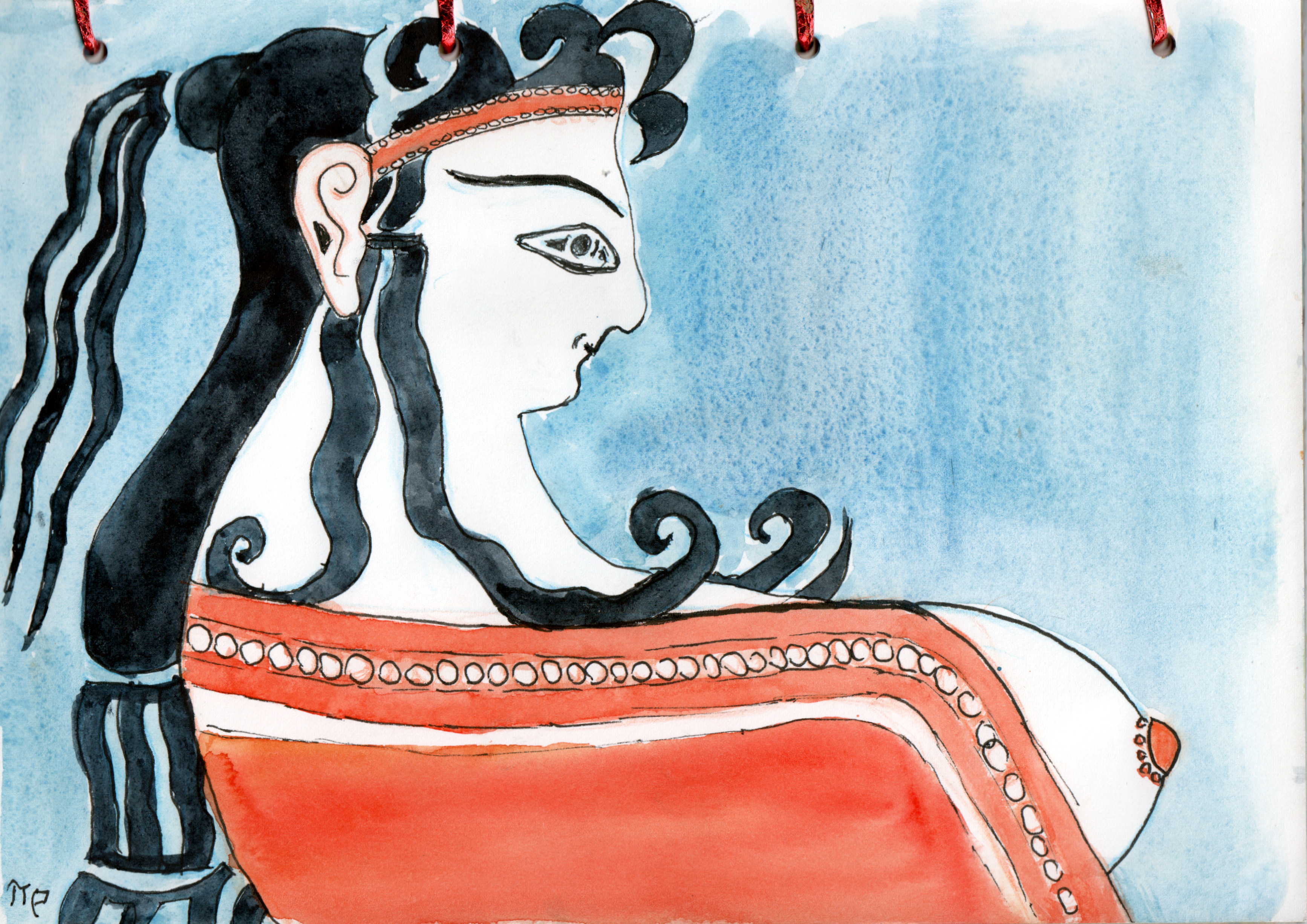
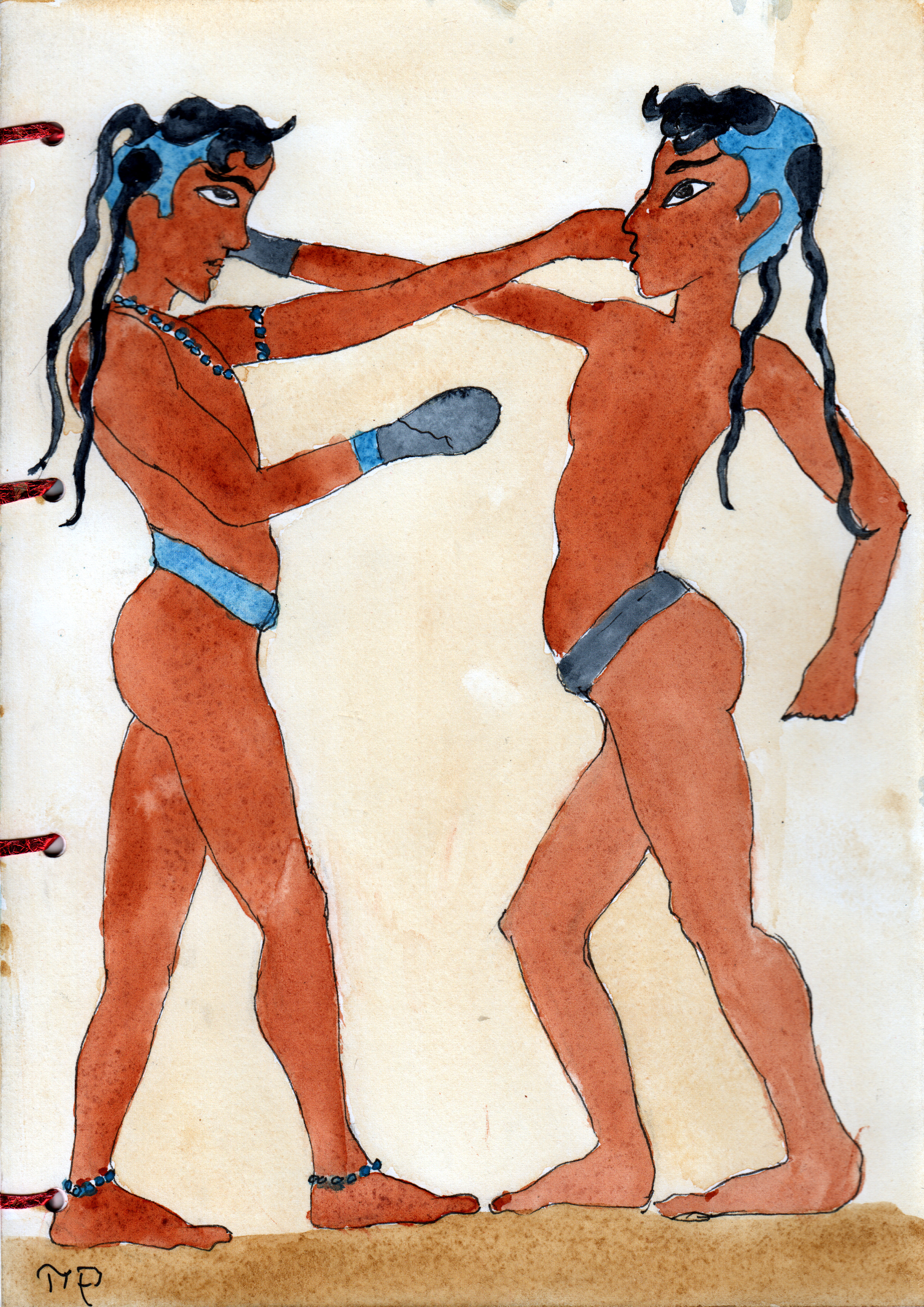
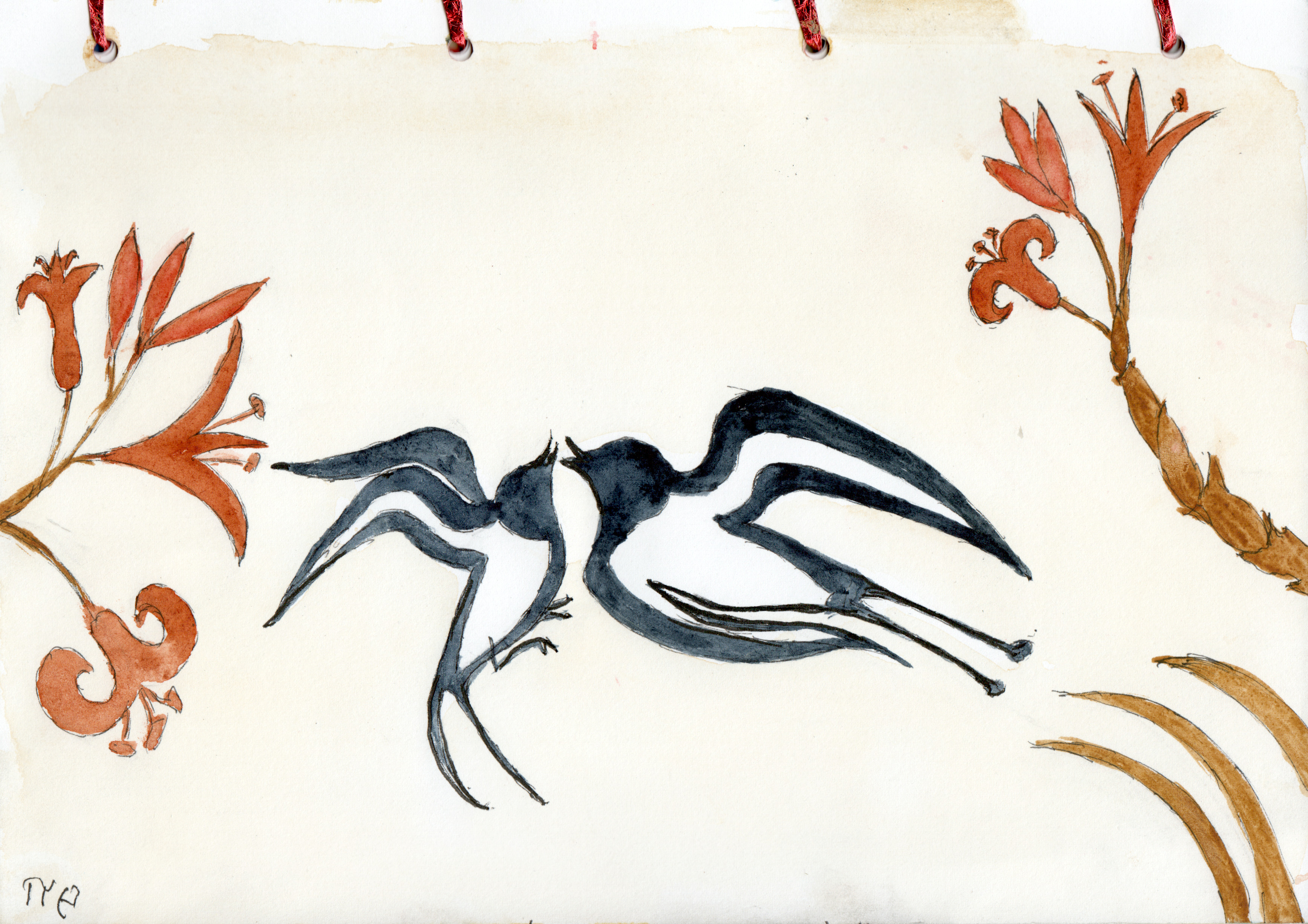
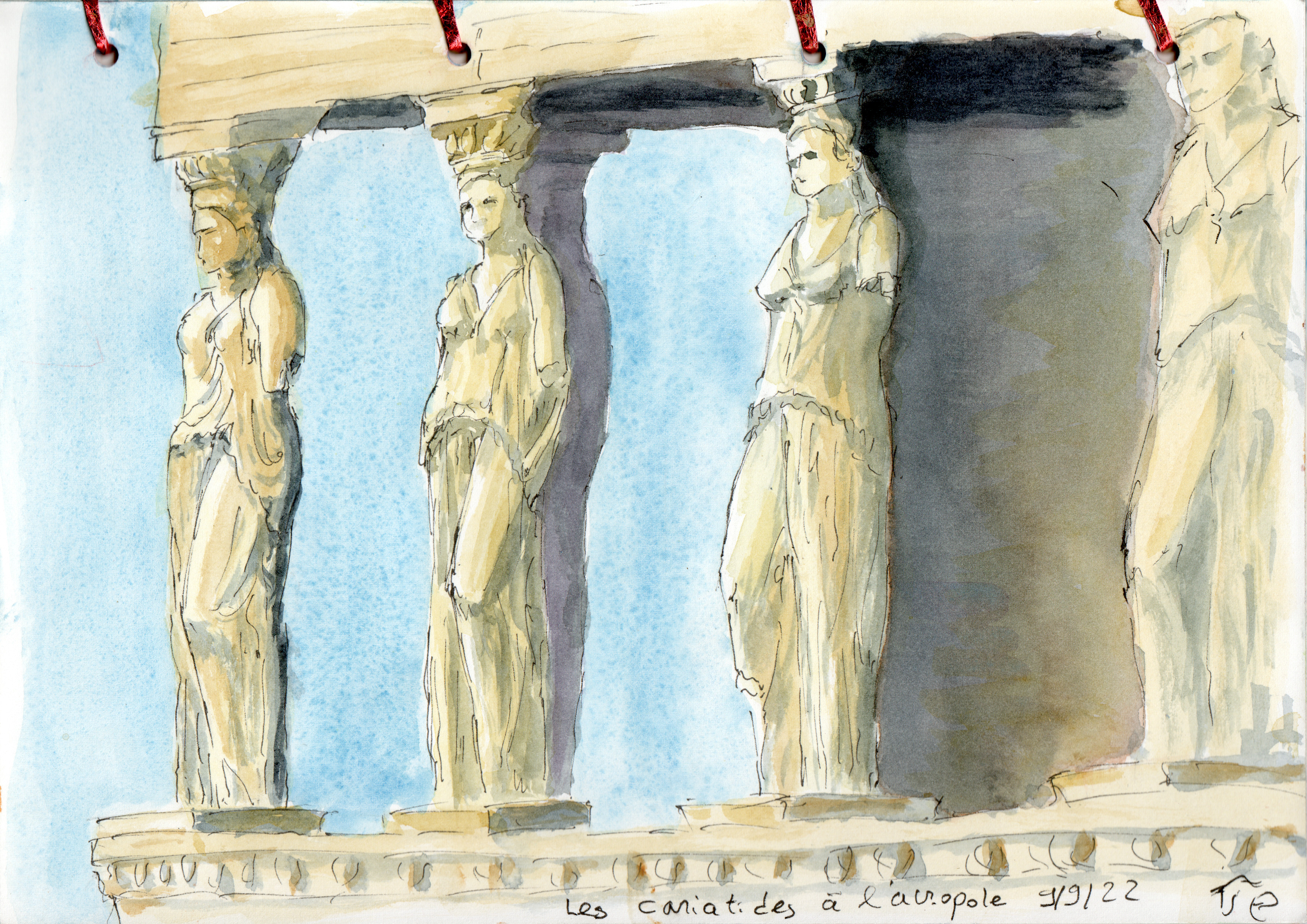
Observe that, when decreasing the window width, the image layout still is dynamically rearranged, but the image size is now fixed: it is maximized so that both width and height are bounded to 300 pixels. Note that the reStructuredText reader will convert underscores (_) to dashes (-) in class names, so to make sure everything runs smoothly, do not use underscores in your transformation names.
Responsive image
Let us increase the sophistication: you can use galleria to automatically generate one time for all a set of images that will be automatically selected for display by browsers according to the viewport width or according to the device resolution. To accomplish this, galleria will add to the html <img> tag both a srcset and style attributes, and optionally sizes attribute.
html5 supports two types of responsive image sets. The first one is device-pixel-ratio-based, selecting higher resolution images for higher resolution devices. The second one is viewport-based, selecting images according to the viewport size. You can read more about html5 responsive images for a gentle introduction to the srcset and <picture> syntaxes.
To tell galleria to generate a responsive image, add a responsive-image transformation to your your GALLERIA_PROCESS dictionary, with the following syntax:
GALLERIA_PROCESS = {
  'crisp': {
      'type': 'responsive-image',
      'srcset': [
          ('1x', ['300x225', '+profile "*"']),
          ('2x', ['600x450', '+profile "*"']),
          ('2x', ['1200x900', '+profile "*"']),
      ],
      'default': '1x',
  },
  'responsive-medium': {
      'type': 'responsive-image',
      'sizes': (
          '(min-width: 768px) 650px, '
          '(min-width: 1200px) 800px, '
          '100vw'
      ),
      'srcset': [
          ('600w', ['600x450', '+profile "*"']),
          ('800w', ['800x600', '+profile "*"']),
      ],
      'default': '800w',
  },
}
Device-based responsive image
The crisp transformation is an example of a transformation enabling device-pixel-ratio-based selection. The srcset is a list of tuples, each tuple containing the image description ('1x', '2x', etc.) and the list of operations to generate the derivative image from the original image. The original image is the value of the src attribute of the <img>. Image descriptions are hints about the resolution of the associated image and must have the suffix x. The default setting specifies the image to use to replace the src attribute of the image. This is the image that will be displayed by browsers that do not support the srcset syntax.
In the two examples above, the default setting is a string referring to one of the images in the srcset. However, the default value could also be a list of operations to generate a different derivative image.
Let us modify the :class: optional field of the galleria directive:
.. galleria::
   tiryns.jpg
   boxers.jpg
   swallows.jpg
   caryatid.jpg
   :class: crisp
We obtain:
Viewport-based responsive image
The responsive-medium transformation is an example of a transformation enabling viewport-based selection. The sizes contains a rule to compute the width of the displayed image from the width of the viewport. Once the browser knows the image width, it will select an image source from the srcset. The srcset is a list of tuple, each tuple containing the image description ('600w', '800w', etc.) and the list of operations to generate the derivative image from the original image. The original image is the value of the src attribute of the <img>. Image descriptions are hints about the width in pixels of the associated image and must have the suffix w. The default setting specifies the image to use to replace the src attribute of the image by a pre-computed one.
Let us modify again the :class: optional field of the galleria directive:
.. galleria::
   tiryns.jpg
   boxers.jpg
   swallows.jpg
   caryatid.jpg
   :class: responsive-medium
We obtain:
Observe that, when decreasing the window width, both the image layout and the image resolution are adapted dynamically.
Picture set
Galleria can be used to generate the images used by a <picture> tag. The <picture> syntax allows for more flexibility in providing a choice of image to the browser. Again, you can read more about the picture tag for a gentle introduction to the srcset and <picture> syntaxes.
To tell galleria to generate the images for a <picture>, add a picture entry to your GALLERIA_PROCESS dictionary with the following syntax:
GALLERIA_PROCESS = {
  'picture-tag': {
     'type': 'picture',
     'sources': [
         {
             'name': 'default',
             'media': '(min-width: 640px)',
             'srcset': [
                 ( '640w', [ '640x480',  '+profile "*"']),
                 ('1024w', ['1024x683',  '+profile "*"']),
                 ('1600w', ['1600x1200', '+profile "*"']),
             ],
             'sizes': '100vw',
         },
         {
             'name': 'source-1',
             'srcset': [
                 ('1x', ['200x200']),
                 ('2x', ['300x300']),
             ]
         },
     ],
     'default': ('default', '640w'),
  },
}
Each of the sources entries is very similar to the responsive-image describe above. Here, each source must have a name, which will be used to find the url of the original image for this source in your article. The source may also have a media, which contains a rule used by the browser to select the active source. The default setting specifies the image to use to replace the src attribute of the <img> inside the <picture>. This is the image that will be displayed by browsers that do not support the <picture> syntax. In this example, it will use the image 640w from the source default. A list of operations could have been specified instead of 640w.
Let us modify again the :class: optional field of the galleria directive:
.. galleria::
   tiryns.jpg
   boxers.jpg
   swallows.jpg
   caryatid.jpg
   :class: picture-tag
and we obtain the illustration presented at the beginning of the introduction section.
Additional settings
When no class is specified in a galleria directive, a class defined in the GALLERIA_PROCESS dictionary is used by default: this user-defined default class should be specified in the GALLERIA_DEFAULT_CLASS variable of the pelicanconf.py file.
The galleria directive has a max-height option. When this option is not specified, the default value is provided by the GALLERIA_DEFAULT_MAX_HEIGHT variable.
Pelican pages and article could provide an :image: in the meta-data section. Themes such as lepagito use this image to automatically produce an icon associated to this page or article, and this icon is then used in the archive section. This icon is automatically generated from an original image by specifying its class in the GALLERIA_ICON_CLASS variable.
By default, the new images will be stored in a directory named output/process/<class-name> in the output folder. All the transformations are written in the output directory in order to avoid confusion with the source files or if we test multiple transformations. You can replace the directory name process by something else using the GALLERIA_PROCESS_DIR variable.
Galleria is able to efficiently process all the image transformation in parallel: use the GALLERIA_RESIZE_JOBS variable to do that. Its default value is 1 and then no parallel computations are done. Setting it to 0 means that the number of parallel process is determined automatically, depending on your computer. Also, you could fix it directly, e.g. to 10.